Representing Energy
User Friendly Energy Visualisation
A 2011 VEIV EngD Group Project by David Hawkins, Ian Henderson, Greig Paterson and Joe Williams
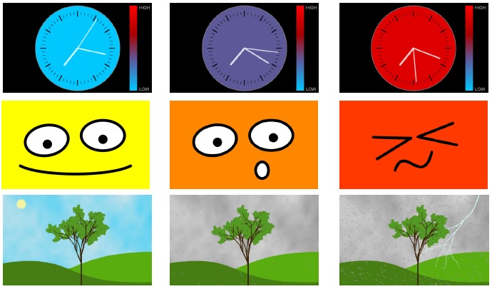
A ‘user friendly energy visualisation' study was carried out in a London house to test three different methods of displaying real-time electricity use. The visualisation themes – functional, emotional and alert - were selected to test research theories on home energy monitoring systems. Each visualisation was assessed in terms of its impact on the occupants’ energy awareness and energy-using behaviour. A monitoring display facility, accessed by tapping the visualisation on a touchscreen monitor, displayed daily budgets, current electricity use and electricity use history graphs.
It was found that user interrogation of the system increased during periods of high electricity use. The family stated that the system had helped to improve awareness of their electricity use and that their household energy efficiency had improved. They expressed a preference for the alert-themed visualisation - a weather scene – and found the daily budget facility particularly useful. The exercise was successful in delivering a technical framework for testing energy use visualisation methods and the findings provided useful recommendations for similar future investigationseased during periods of high electricity use. The family stated that the system had helped to improve awareness of their electricity use and that their household energy efficiency had improved. They expressed a preference for the alert-themed visualisation - a weather scene – and found the daily budget facility particularly useful. The exercise was successful in delivering a technical framework for testing energy use visualisation methods and the findings provided useful recommendations for similar future investigations